

|
 |

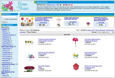
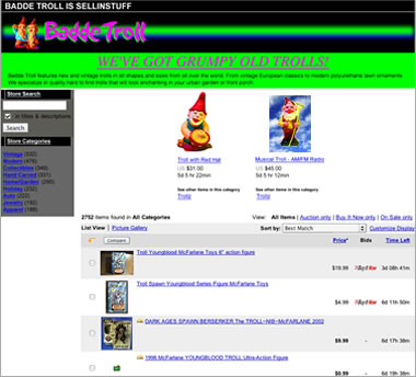
| Designing your eBay Store can be easy. Just follow our top do's and don'ts to ensure you're applying best practices to your Store design. |
|
 |
Do's
- Choose complimentary colors. Reference the color wheel for recommendations.
- Make sure your background and font colors have good contrast.
- Make sure your photographs all have the same colored background.
- Make sure your buyers can see the items to buy when they look at your storefront. Place them high on the page.
- Make a great first impression with a professional Store Logo.
- Include your Store name in a logo that plays well with the rest of your Store design.
- Write a good Store
Description that describes what you sell.
|
 |
 |
Don'ts
- Avoid too much white space.
- Avoid black backgrounds which make it difficult for buyers to navigate your Store.
- Avoid using large fonts, different types of fonts as well as different colors for text.
- Limit the use of fluorescent colors.
- Minimize the use of animation
as it may cause the page to load slowly.
|
 |
 |
|
|
 |
Color Wheel
Understanding color theory will help you to understand how color works with your eBay Store. A good tool to learn about color is via the color wheel created by Sir Isaac Newton. This color wheel allows you to view groupings of colors that go well together as well as colors that don't.
Complementary Colors: Colors that are opposite one another on the color wheel. For example: red and green or blue and orange.
Analogous Colors: Colors that sit next to each other on the color wheel. For example: green, yellow-green, and yellow; or red, red-orange, and orange.
|
|
|


